22 Bathroom Tile Ideas for 2026
I see 2026 bathroom tile trends leaning toward color, character, and layouts that feel intentional rather than trendy. Instead of sterile finishes, these ideas focus on tiles that add warmth, depth, and personality through thoughtful combinations of color, scale, and placement. Each approach balances visual interest with everyday practicality, creating bathrooms that feel curated, lived-in, and timeless while still embracing a fresh, modern direction.
1. Soft Green Wall Tiles with Vintage Fixtures
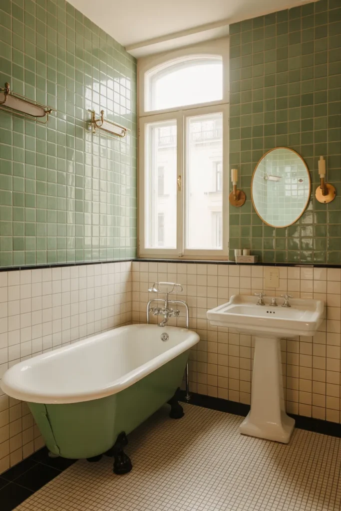
I love how soft green wall tiles instantly calm the room while still adding color. The glossy finish reflects light beautifully, especially in bathrooms with tall windows or classic proportions. Pairing green tiles with white lower walls keeps the space grounded and prevents the color from feeling heavy or overwhelming.
Vintage-inspired fixtures elevate this look even further by adding warmth and contrast. Brass or aged chrome finishes work especially well against green tile, creating a layered, timeless feel. This combination feels personal, elegant, and perfect for anyone who wants a bathroom that feels both soothing and character-rich.
2. Patterned Blue Floor Tiles with Neutral Walls
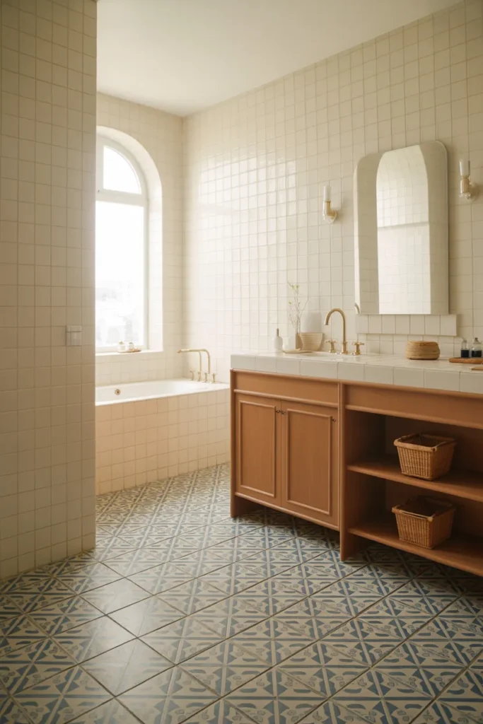
Patterned floor tiles are one of my favorite ways to bring color into a bathroom without overwhelming the walls. Blue motifs add movement and personality, while neutral walls allow the floor to remain the star. This approach works especially well in small or narrow spaces.
Keeping the walls simple helps the room feel open and airy. Wood accents and warm metals balance the cool blue tones, preventing the design from feeling too sharp. The result feels playful yet grounded, making the bathroom feel intentional rather than overly decorative.
3. Two-Tone Tile Walls in Cream and Mint
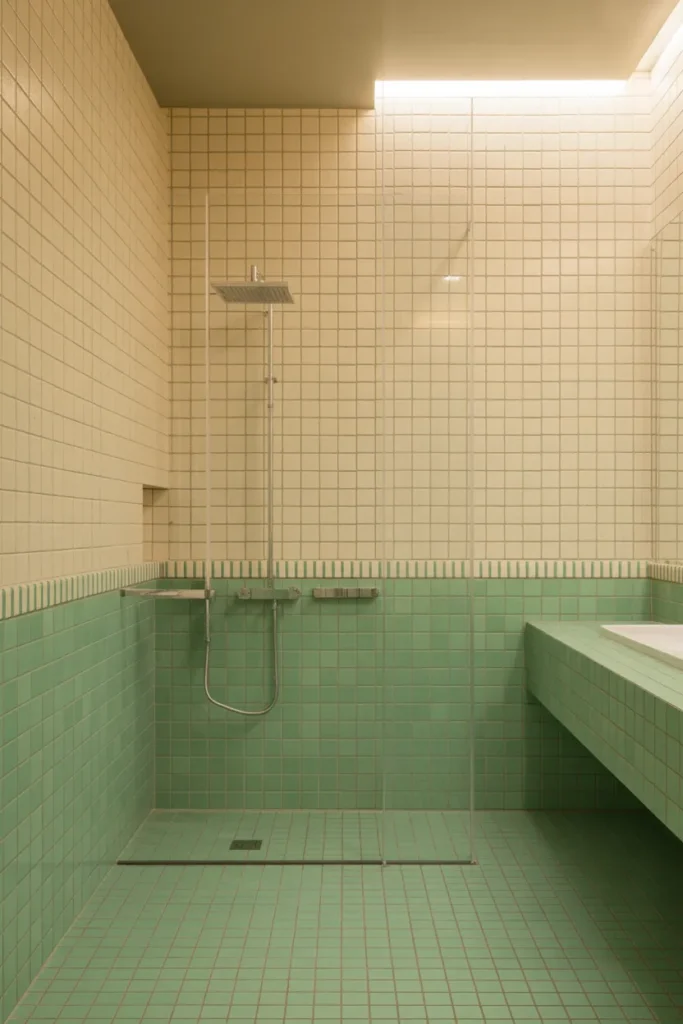
Two-tone tile walls create visual structure without needing bold patterns. I like using cream on top to keep the space light, while mint below adds freshness and subtle color. The horizontal division also helps define the room’s proportions beautifully.
This setup feels especially modern when paired with clean-lined fixtures and minimal décor. Mint works well as a color that feels cheerful but not overpowering. Together, these tones create a bathroom that feels relaxed, balanced, and easy to live with long term.
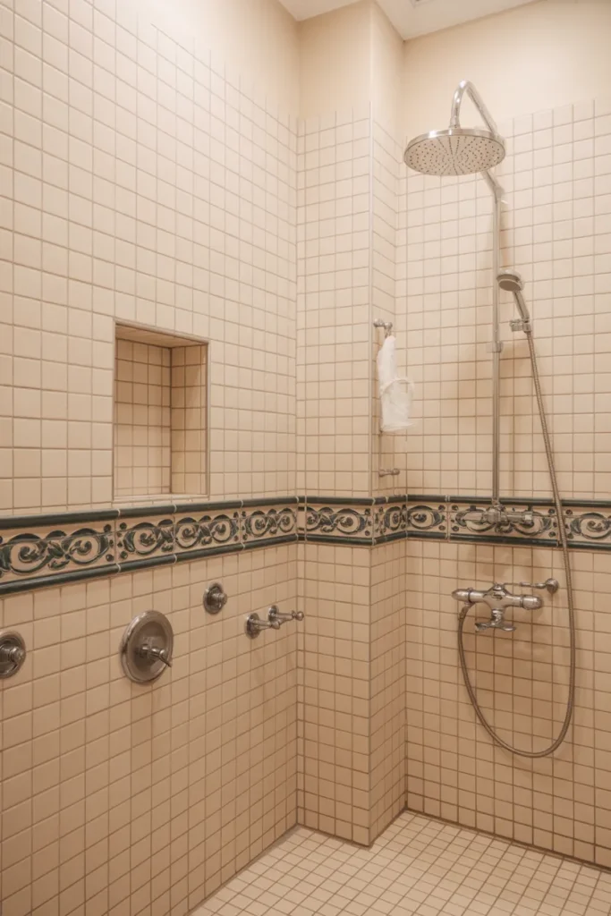
4. Warm Beige Tiles with Blue Accent Strip
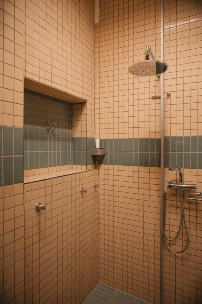
Accent tile strips are a subtle way to introduce color without committing to a full statement wall. I like how a blue band breaks up warm beige tiles and adds a gentle focal point. It draws the eye without interrupting the overall calmness of the space.
This idea works beautifully in showers, where the accent can align with niches or fixtures. Beige keeps the room feeling warm and timeless, while blue adds just enough contrast to make the design feel current and thoughtfully layered.
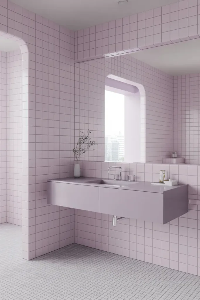
5. Pale Pink Tiles with Brass Details
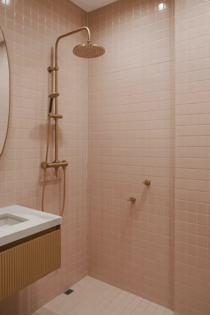
Pale pink tiles bring warmth and softness without feeling overly sweet. I like how this color reflects light and creates a gentle glow, especially in bathrooms with limited natural light. The glossy finish keeps the look polished and modern.
Brass details elevate the palette by adding richness and contrast. When paired with light wood or white surfaces, pink tiles feel sophisticated and grown-up. This approach adds personality while still feeling versatile and easy to style.
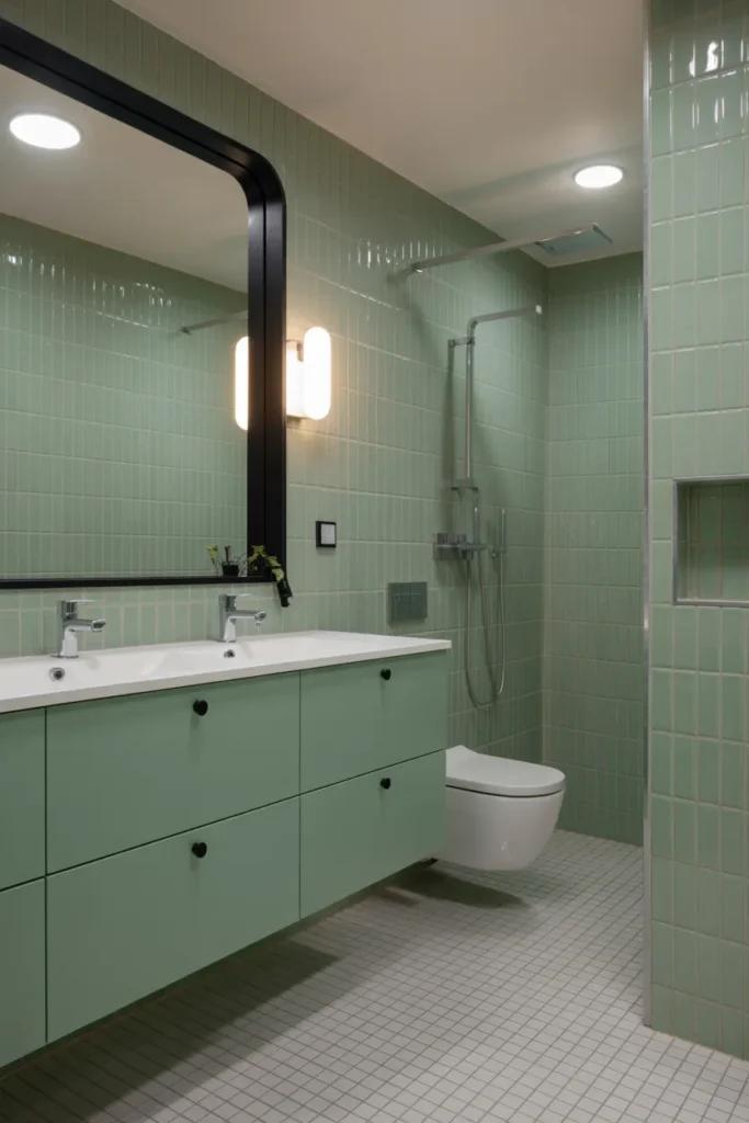
6. Sage Green Shower Tiles with White Surrounds
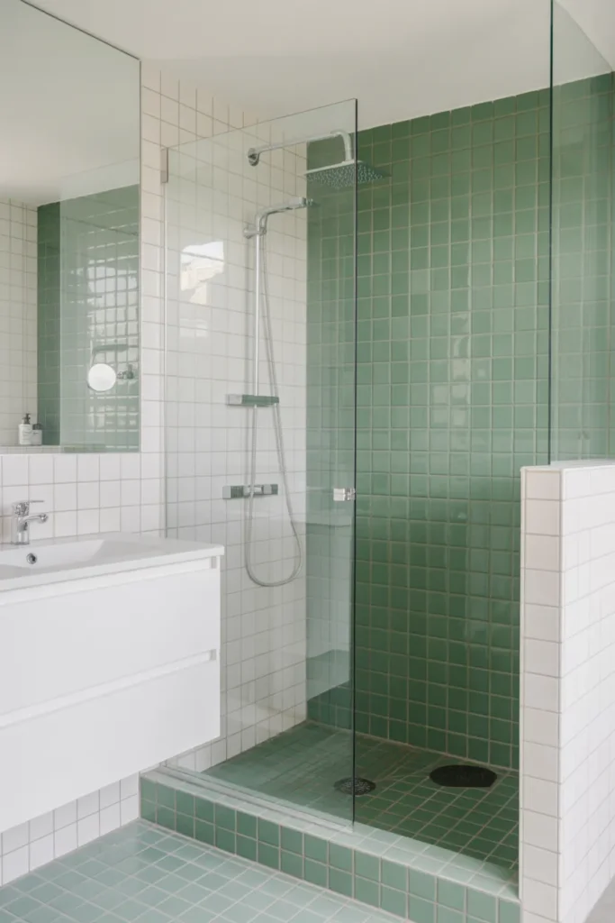
Using color inside the shower is a smart way to create depth without overwhelming the entire room. I like sage green here because it feels fresh and natural, yet subtle enough to stay timeless. The contrast with white tiles keeps everything feeling crisp.
This layout works especially well in smaller bathrooms where full-color walls might feel too bold. The green shower zone becomes a focal point, adding interest while maintaining a clean, open atmosphere throughout the space.
7. Checkerboard Tiles in Soft Pastels
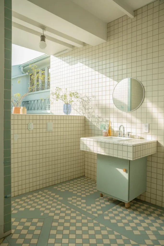
Checkerboard tiles feel playful without being loud when done in soft colors. I love using pastel blue paired with cream to create a gentle contrast that still feels lively. This pattern adds rhythm and personality to the space.
Keeping the walls simple ensures the floor doesn’t overwhelm the room. This idea works beautifully in powder rooms or smaller bathrooms where a bold floor can shine. The result feels joyful, inviting, and full of character.
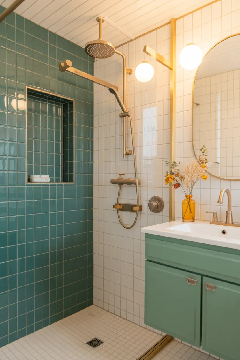
8. Muted Teal Wall Tiles with Wood Vanity
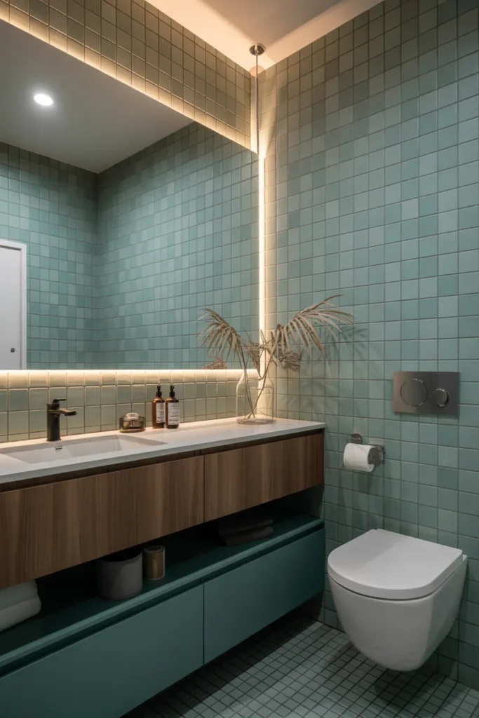
Muted teal brings depth and richness without feeling overpowering. I like how this shade adds drama while still remaining calming, especially when paired with warm wood tones. The matte finish keeps the look refined and modern.
Wood vanities soften the coolness of teal tiles, creating a welcoming contrast. This combination feels intentional and stylish, making the bathroom feel like a designed space rather than a purely functional one.
9. Cream Tiles with Colorful Niche Inserts
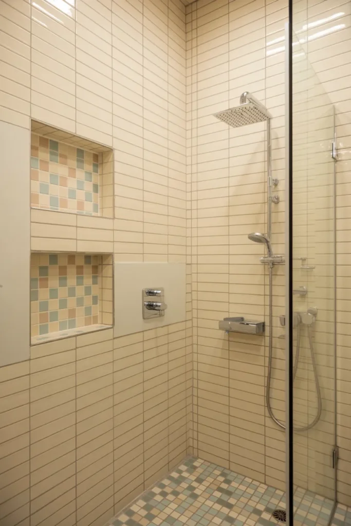
Adding color through niche inserts is a flexible way to experiment without committing to full walls. I love how small bursts of pastel tiles create moments of interest while keeping the overall palette calm and cohesive.
This approach works especially well in minimalist bathrooms that need a touch of personality. The cream tiles provide a neutral backdrop, allowing the colorful niches to feel intentional, playful, and easy to update over time.
10. Light Blue Subway Tiles with Vertical Layout
Vertical tile layouts instantly make bathrooms feel taller. I like using light blue here because it enhances that airy feeling while adding soft color. The vertical orientation feels fresh and slightly unexpected.
White grout keeps the look crisp and prevents the blue from feeling too dominant. This setup works beautifully in contemporary spaces, offering a subtle twist on classic subway tiles while staying timeless and approachable.
11. Multicolor Mosaic Floor with White Walls
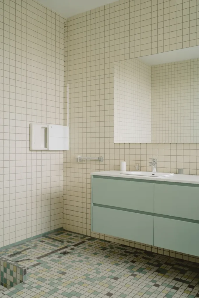
Multicolor mosaic floors bring energy and texture into the bathroom without overwhelming the walls. I like how blending several soft hues creates depth while still feeling cohesive. The floor becomes a visual anchor for the entire space.
White walls allow the mosaic pattern to stand out and keep the room feeling open. This idea works especially well in bathrooms where you want color and personality, but still value a clean, modern overall look.
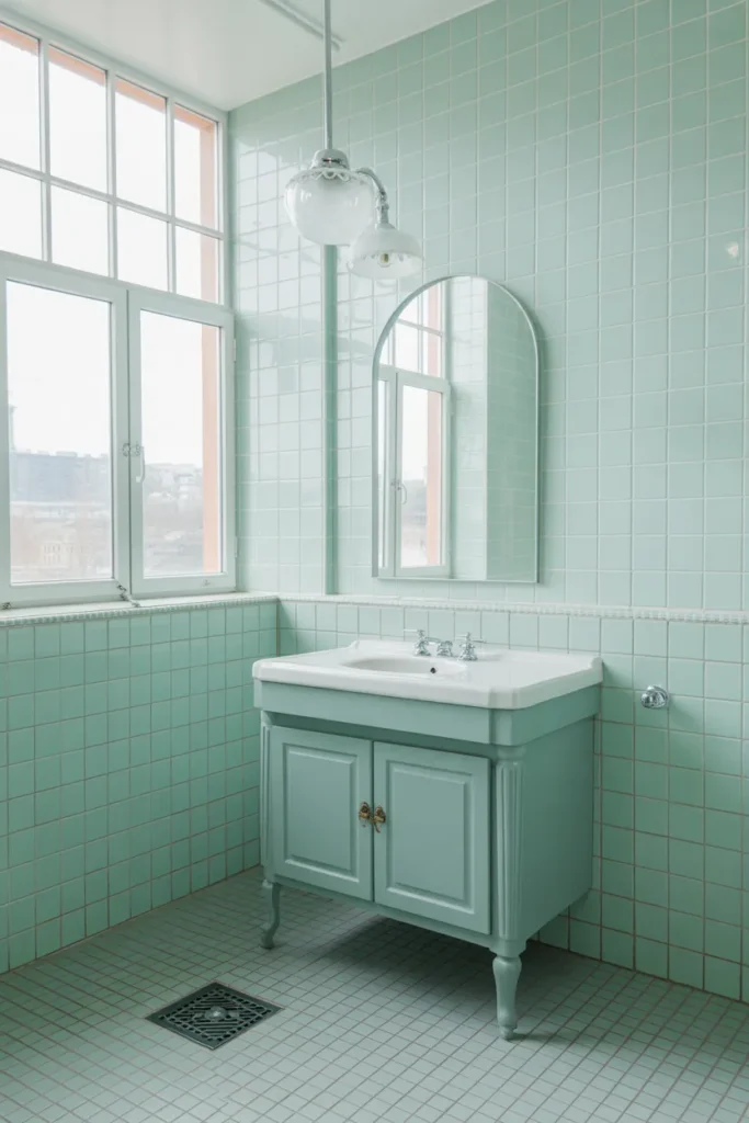
12. Mint Green Floor Tiles with White Walls
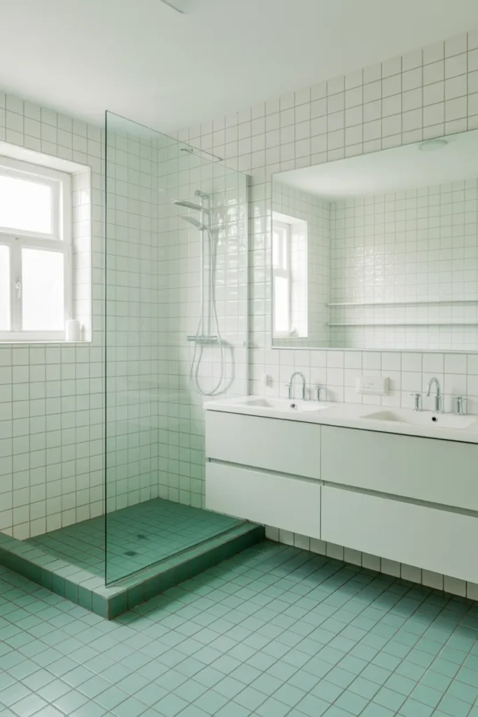
I like using mint green on the floor because it adds color without closing in the space. The subtle tone feels refreshing and light, especially when paired with crisp white walls. This balance keeps the bathroom feeling open and visually calm.
White walls allow the floor to take center stage while reflecting light evenly. The mint tone adds personality in a controlled way, making the room feel cheerful yet minimal. It’s an easy option for adding color without committing to bold wall tiles.
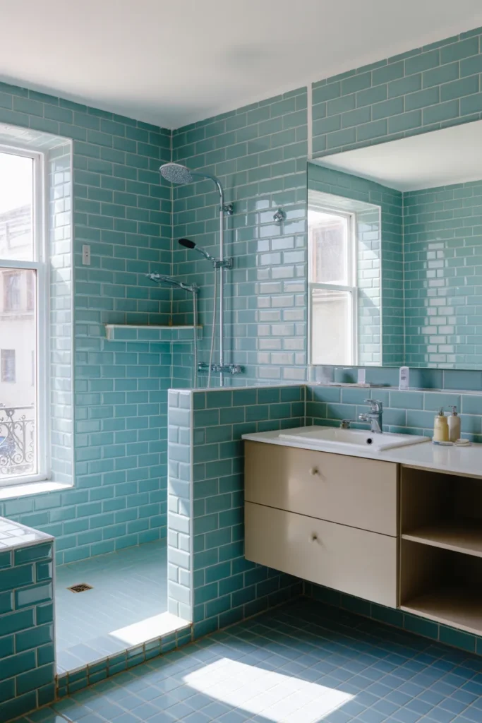
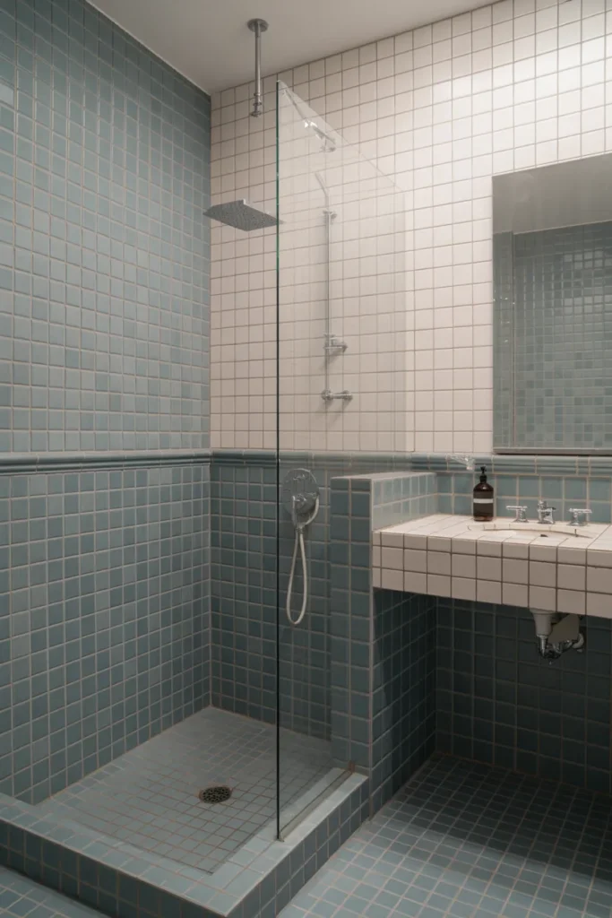
13. Sky Blue Tiles with Matching Shower Curb
Sky blue tiles create an instant sense of openness and clarity. I love how extending the same color onto the shower curb creates a cohesive, built-in look. The color feels calm but still visually interesting.
This approach works beautifully in bathrooms with natural light. White grout keeps the blue looking fresh rather than heavy. The result feels intentional, clean, and slightly playful without sacrificing a modern aesthetic.
14. Cream Tiles with Soft Yellow Accents
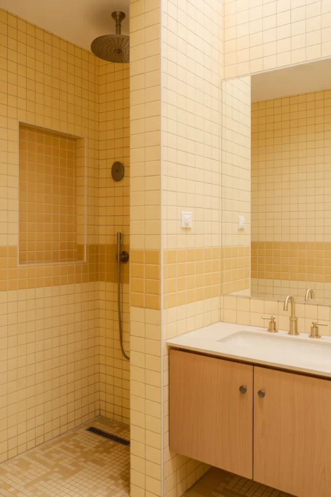
Soft yellow accents bring warmth and optimism into the bathroom. I like using yellow sparingly so it adds character without overpowering the space. Against cream tiles, the color feels gentle and inviting.
This idea works well for bathrooms that feel too neutral or flat. The yellow detail creates visual interest while maintaining a calm atmosphere. It’s a subtle way to introduce color that still feels timeless and welcoming.
15. Pale Lavender Wall Tiles with White Floors
Lavender tiles add softness and personality without feeling overly decorative. I enjoy how this color shifts subtly depending on the light, giving the bathroom a gentle, calming presence throughout the day.
White floors ground the space and keep it feeling clean and balanced. This pairing feels fresh and slightly unexpected, perfect for anyone wanting a bathroom that feels unique but still restrained and elegant.
16. Blue and White Grid Tile Combination
Mixing blue and white tiles in a grid creates structure and visual rhythm. I like how this approach adds pattern without relying on bold graphics. The repetition feels ordered and calming.
This design works especially well in bathrooms with simple fixtures and minimal décor. The tile pattern becomes the main feature, adding interest while still feeling timeless and architectural.
17. Soft Coral Tiles with Neutral Fixtures
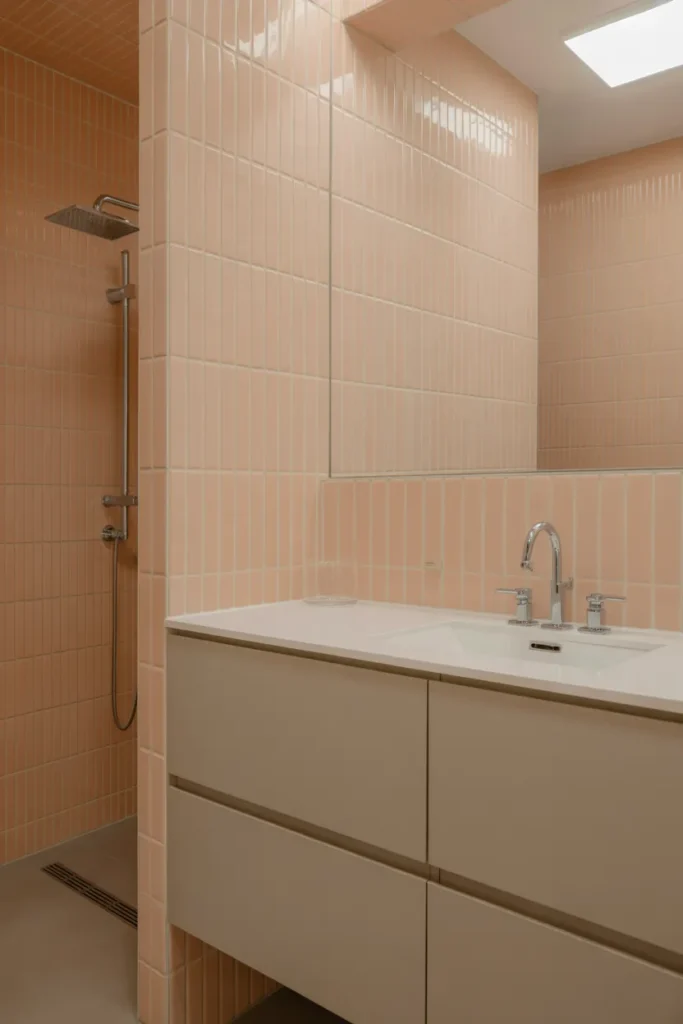
Soft coral brings warmth and energy without being overpowering. I love how this shade feels lively yet refined, especially when paired with neutral fixtures and clean lines.
Keeping the rest of the bathroom simple allows the coral tiles to shine. This color choice feels modern and optimistic, making the space feel welcoming and thoughtfully designed rather than trendy.
18. Green and Cream Vertical Tile Split
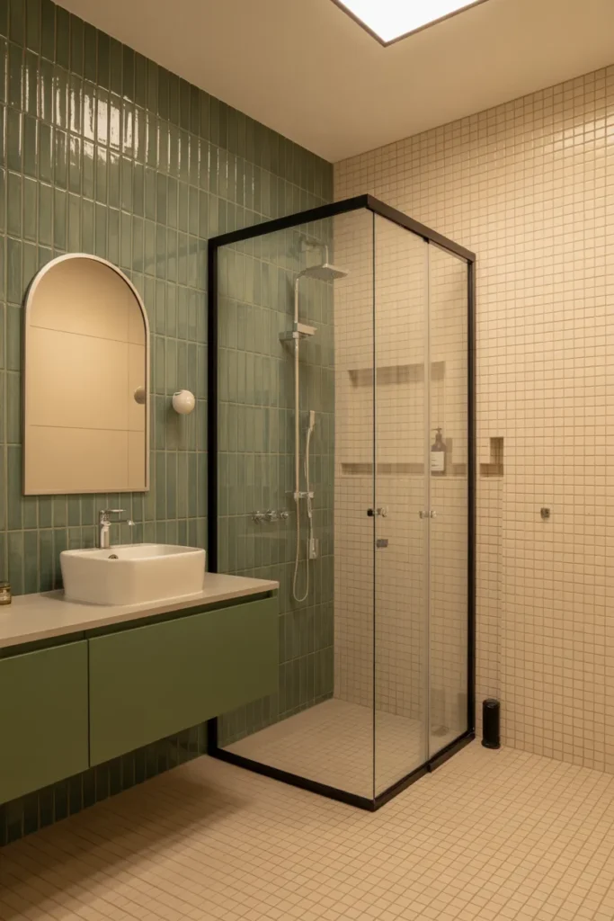
Vertical green tiles add height and visual movement to the bathroom. I like using color on a single wall to create focus without overwhelming the space. The vertical orientation keeps everything feeling tall and open.
Cream tiles balance the green by adding warmth and neutrality. This contrast feels deliberate and modern, creating a bathroom that feels structured, fresh, and visually dynamic.
19. Powder Blue Tiles with Wooden Shelving
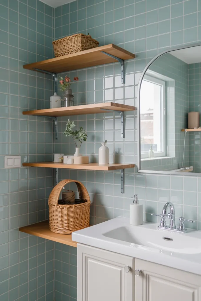
Powder blue tiles feel light, friendly, and approachable. I enjoy how this shade adds color without demanding attention. It creates a relaxed backdrop that works beautifully with natural materials.
Wooden shelving adds warmth and texture, preventing the blue from feeling too cool. This combination feels casual yet polished, ideal for bathrooms that aim to feel comfortable and inviting.
20. Multicolor Border Tiles on Neutral Walls
Using multicolor border tiles is a great way to introduce playful detail. I like how a thin band of color breaks up neutral walls without overwhelming the design. It feels decorative yet controlled.
This approach works well in bathrooms that need visual interest without bold patterns. The neutral base keeps the room calm, while the border adds personality and a custom feel.
21. Seafoam Green Tiles with Matte Finish
Seafoam green feels fresh and modern, especially with a matte finish. I like how it absorbs light softly, creating a calm and relaxed atmosphere. The color feels clean without being cold.
White floors keep the palette balanced and bright. This combination works well for bathrooms aiming for a modern look that still feels warm and approachable rather than stark.
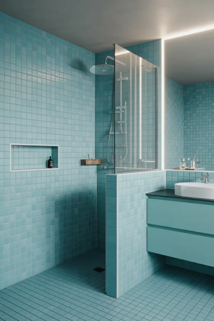
22. Light Turquoise Tiles with White Trim
Light turquoise tiles bring energy and brightness into the bathroom. I enjoy how this color feels cheerful and fresh, especially when paired with plenty of natural light.
White trim adds definition and structure, preventing the color from feeling too bold. This idea creates a lively yet polished bathroom that feels optimistic, colorful, and timeless for 2026.