22 Colorful Kitchen Tile Ideas for 2026
Kitchen tile design in 2026 leans toward warmth, personality, and carefully balanced color. Instead of sterile minimalism, spaces now highlight texture, handmade finishes, and expressive palettes that still feel timeless. From softly patterned floors to richly glazed backsplashes, tiles play a major role in shaping atmosphere. The following ideas focus on realistic, livable kitchens inspired by modern European interiors, combining color, material, and light in ways that feel current, inviting, and thoughtfully designed.
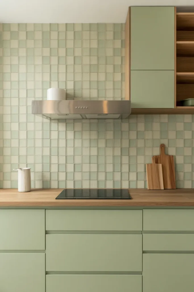
Sage Green Brick Backsplash with Open Shelving
Soft sage brick tiles bring a grounded calm to kitchen walls while still offering subtle color. Their elongated shape introduces rhythm, especially when paired with open wooden shelving that breaks up the surface. Natural light enhances the tile glaze, creating gentle variation rather than a flat look. This approach works especially well in kitchens that prioritize warmth and texture over stark contrast or high-gloss finishes.
By combining muted green tiles with wood tones, the space feels relaxed yet intentional. The brick layout references classic masonry while remaining fresh through color choice. Neutral cabinetry allows the backsplash to stand out without overwhelming the room. This idea suits homeowners seeking a balance between rustic charm and modern structure, especially in kitchens designed for everyday comfort rather than show-only aesthetics.
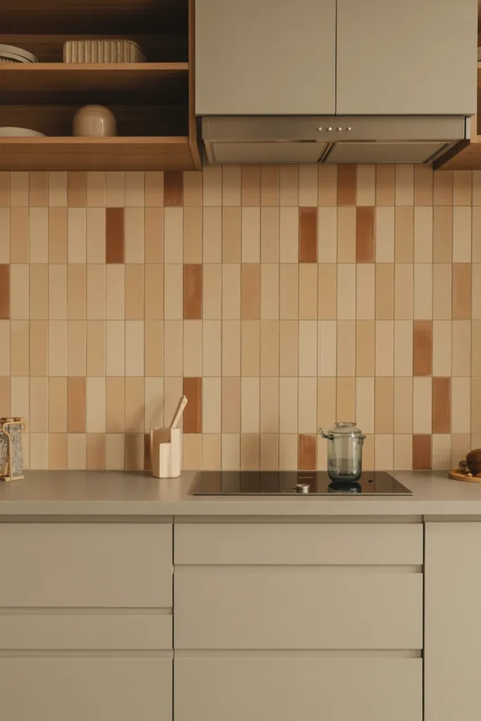
Patterned Terracotta and Cream Floor Tiles
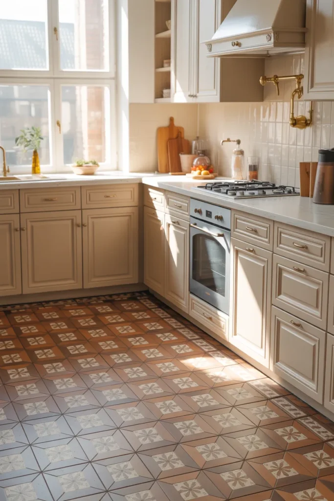
Patterned floor tiles instantly anchor a kitchen, and terracotta tones add warmth that feels timeless. When blended with soft cream accents, the result is rich but not heavy. These tiles work beautifully in spaces with neutral cabinetry, allowing the floor to become the visual focus. Natural light emphasizes the subtle color variation, making the pattern feel lived-in rather than decorative.
Floor tiles like these create continuity across the space, especially in open-plan kitchens. Their traditional inspiration pairs well with modern layouts, offering depth without visual clutter. The warm palette also softens hard surfaces, making the kitchen feel more welcoming. This idea suits homes that value character and history while still embracing updated cabinetry and contemporary lighting choices.
Muted Blue Vertical Subway Tile Backsplash
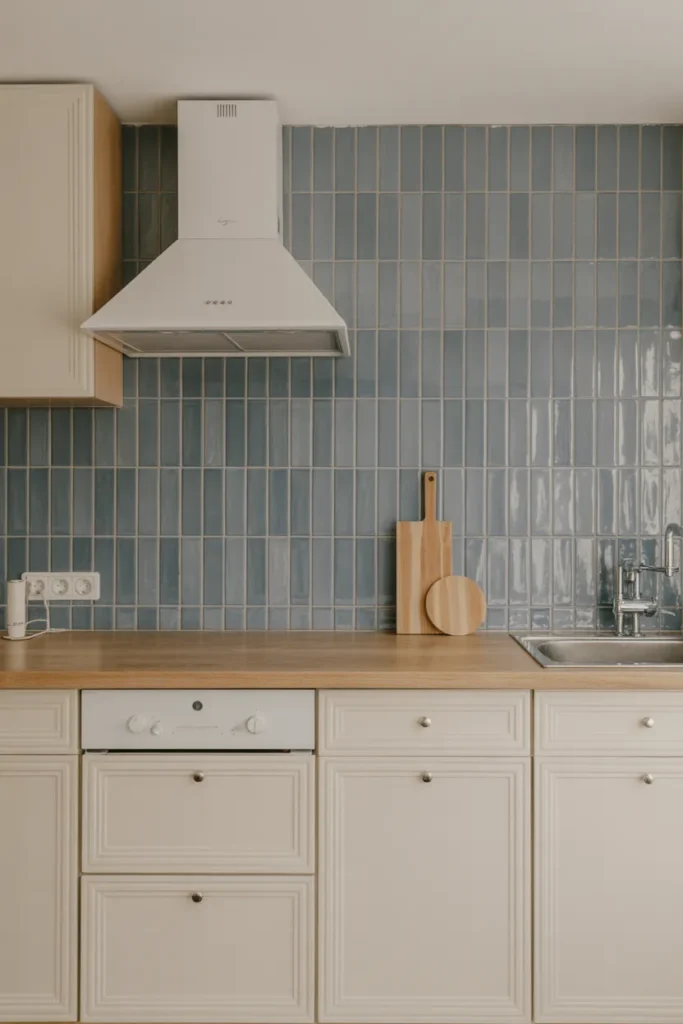
Vertical subway tiles subtly shift the eye upward, making kitchens feel taller and more open. Muted blue tones add color without dominating the space, especially when balanced with cream cabinets and light wood surfaces. The vertical layout feels fresh compared to traditional horizontal arrangements, offering a quiet update that still feels approachable and timeless.
Color plays a supporting role here, enhancing the atmosphere rather than commanding attention. Blue tiles reflect light softly, preventing the backsplash from feeling dark or heavy. This approach works well in kitchens that favor simplicity but want a hint of personality. The result feels calm, structured, and ideal for everyday use in modern homes.
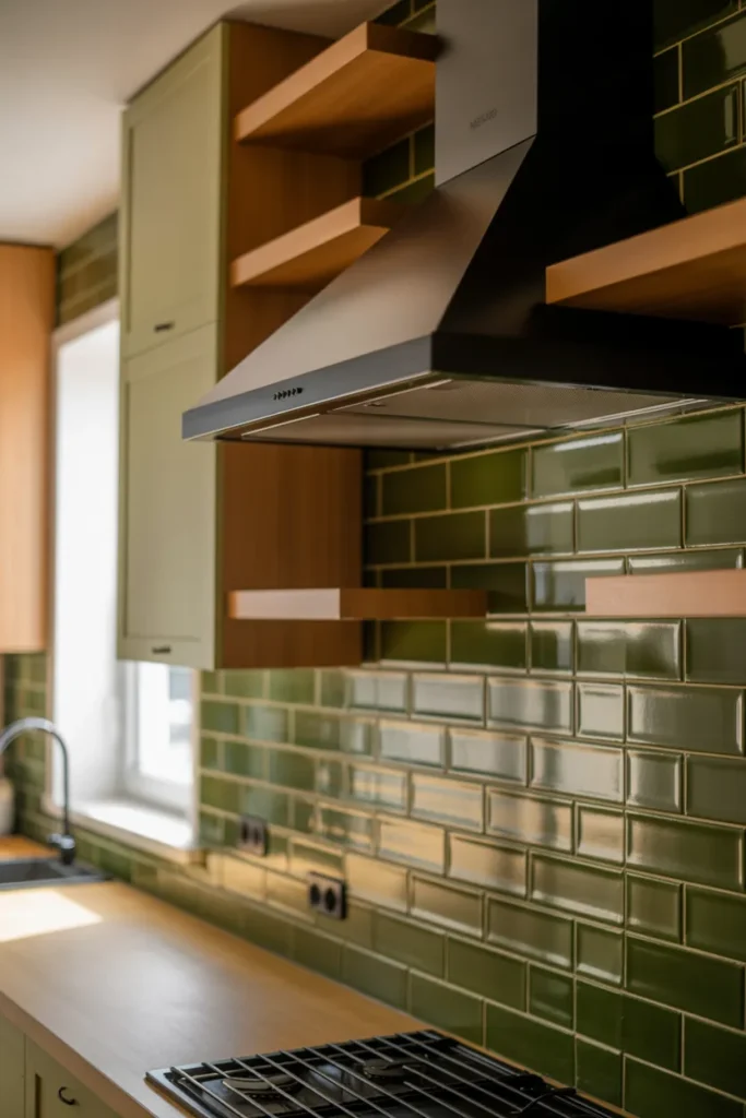
Olive Green Tiles with Black Accents
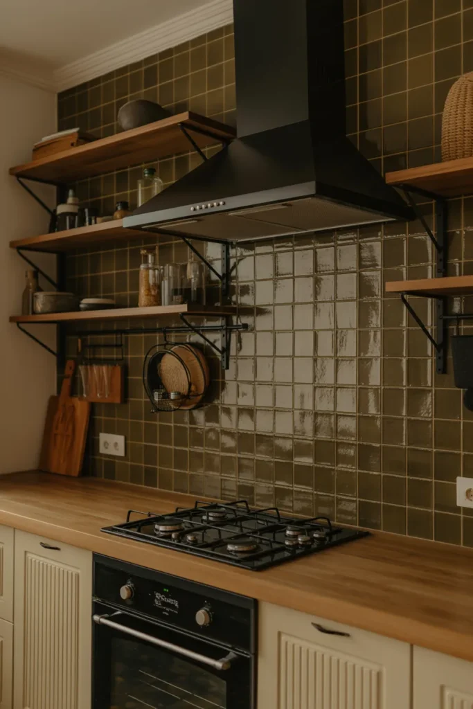
Olive green tiles create a rich, earthy backdrop that pairs naturally with black metal accents. This combination feels grounded and confident without leaning industrial. The depth of color adds visual interest, especially when offset by warm wood counters and shelves. Ambient lighting enhances the tile surface, highlighting its texture rather than flattening it.
Such a palette suits kitchens designed to feel cozy yet refined. The green tone connects the interior to nature, while black details introduce contrast and structure. This idea works particularly well in homes that favor organic materials and subdued color schemes. The overall effect is timeless, comfortable, and visually balanced without feeling overly styled.
Butter Yellow Square Tile Backsplash
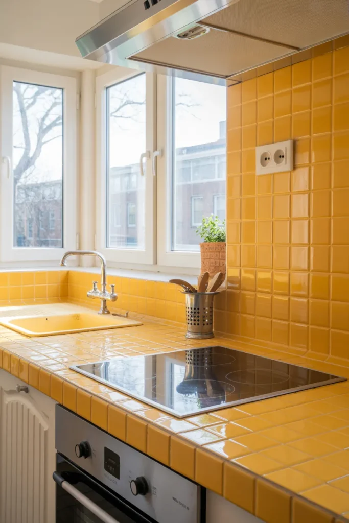
Butter yellow tiles bring optimism and warmth into kitchen spaces, especially when used in a classic square format. Their glossy surface reflects light, making smaller kitchens feel brighter and more open. Paired with white cabinetry, the color feels intentional rather than overwhelming, offering cheerfulness without veering into retro novelty.
This color choice works best when the rest of the kitchen remains simple and uncluttered. Chrome or stainless fixtures keep the look modern, while the tile color provides personality. Yellow tones also complement natural daylight beautifully, shifting subtly throughout the day. The result is a welcoming kitchen that feels lively, clean, and easy to live with.
Encaustic-Style Tiles in Soft Earth Tones
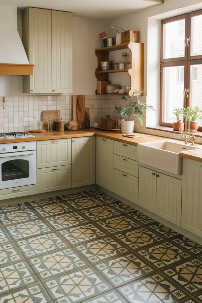
Encaustic-style tiles offer intricate pattern without overwhelming when colors stay muted. Soft earth tones create harmony with cabinetry and wood details, allowing the floor to ground the space visually. These tiles introduce craftsmanship and tradition while remaining suitable for modern kitchens that value durability and visual depth.
Used across the main floor area, the pattern brings movement and personality. The restrained palette ensures longevity, preventing the design from feeling trend-driven. This idea works particularly well in kitchens that serve as gathering spaces, where warmth and visual interest matter. The overall effect feels layered, thoughtful, and comfortably timeless.
Checkerboard Tiles in Sage and White
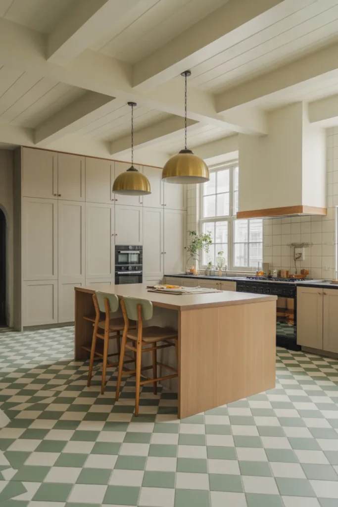
Checkerboard floors return in 2026 with softer color contrasts. Sage green paired with white feels fresh and approachable, avoiding the harshness of black-and-white versions. The pattern adds structure and rhythm, especially in open kitchens where the floor defines zones.
This idea suits kitchens aiming for a modern farmhouse or transitional style. The subtle color variation keeps the pattern from overpowering the space. Combined with warm wood and brass details, the tiles feel intentional and updated. The result is playful yet refined, offering visual interest without sacrificing versatility or long-term appeal.
Clay Pink Satin Finish Tiles
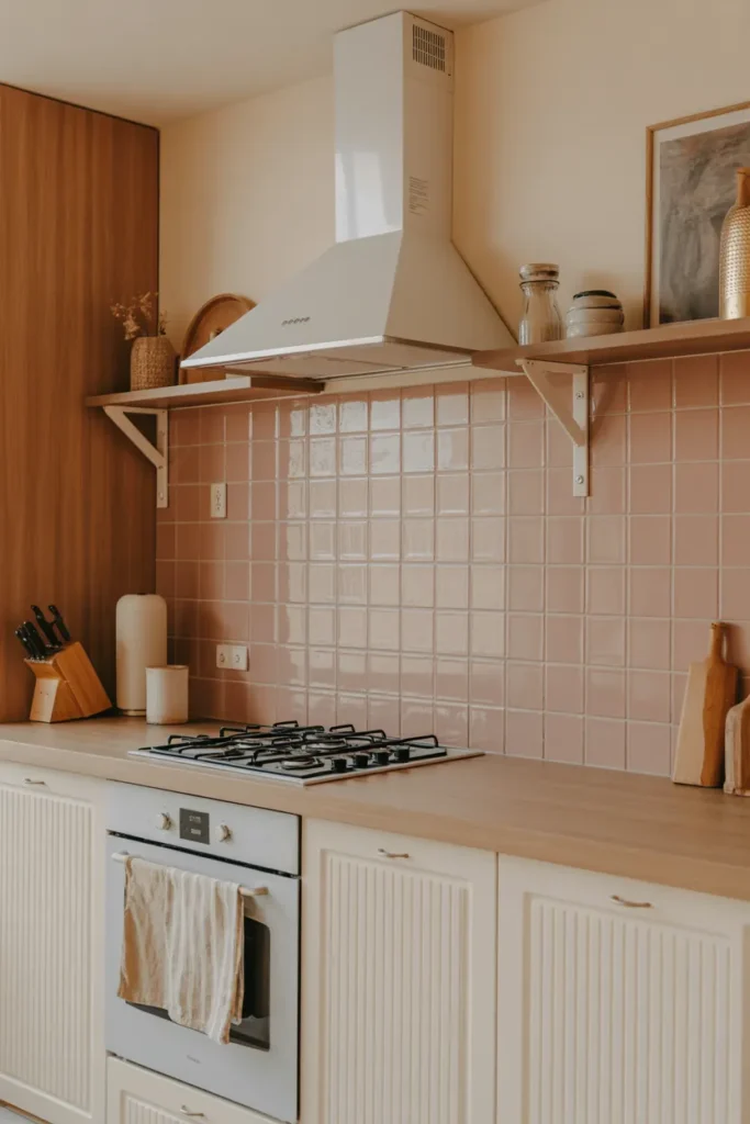
Clay pink tiles introduce warmth and softness without leaning overly feminine or bold. A satin finish diffuses light gently, creating a calm surface that feels tactile. When paired with light wood cabinetry, the color reads as neutral-adjacent, adding depth rather than contrast.
This palette works well in kitchens designed for relaxation and daily use. Pink tones soften sharp lines and hard materials, making the space feel more welcoming. The key lies in restraint, allowing the tile color to complement rather than dominate. The result feels modern, cozy, and quietly expressive.
Teal Handmade Ceramic Backsplash
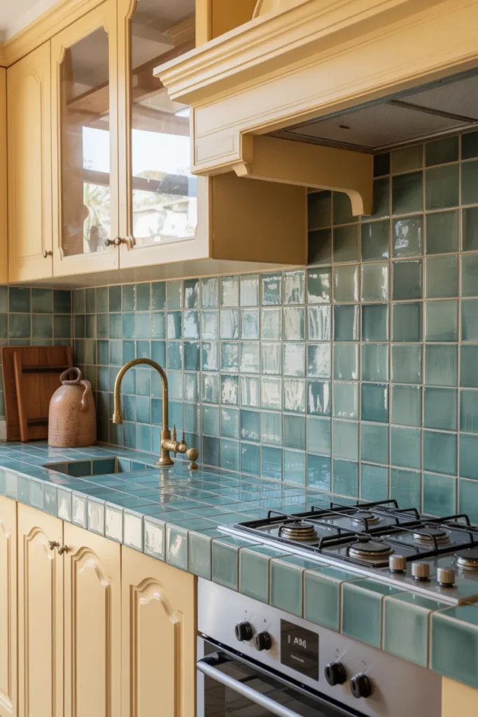
Teal tiles with handmade texture bring artisan character into modern kitchens. Slight surface variation catches the light, adding depth and movement. Paired with cream cabinetry, the color feels rich but balanced, evoking coastal influences without feeling themed.
This approach suits kitchens that value individuality and craftsmanship. The handmade look contrasts beautifully with clean cabinetry lines, creating visual tension that feels intentional. Teal also works across seasons, feeling cool in summer and cozy in winter. The result is a backsplash that feels expressive, timeless, and rooted in material quality.
Mixed Pastel Square Tile Feature Wall
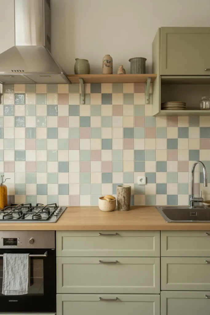
Mixing pastel tiles within a controlled palette creates visual interest without chaos. Square formats keep the look structured, while color variation introduces playfulness. This approach works well as a feature wall or backsplash, allowing the rest of the kitchen to remain calm and cohesive.
Color placement feels intentional rather than random, making the design suitable for long-term living. Neutral cabinetry ensures the tiles remain the focal point. The result feels cheerful yet composed, ideal for kitchens that want personality without strong pattern or contrast.
Vertical Two-Tone Tile Backsplash
Two-tone vertical tiles create subtle color blocking that feels architectural. Warm cream and caramel tones blend naturally, adding depth without harsh contrast. The vertical orientation enhances height, making kitchens feel more open and refined.
This idea suits minimalist spaces that still crave warmth. Color variation replaces ornamentation, allowing the tile layout to do the work. Soft lighting enhances the tonal shifts, creating a calm, layered effect. The result feels modern, understated, and well-suited to contemporary European-inspired interiors.
Pistachio Green Matte Wall Tiles
Pistachio green offers freshness without intensity, making it ideal for matte wall tiles. Large formats reduce grout lines, creating a calm, continuous surface. The soft green tone pairs naturally with wood, reinforcing a connection to nature.
This look works best in kitchens that value simplicity and material quality. The matte finish absorbs light gently, avoiding glare and visual noise. Pistachio green also adapts well to changing trends, remaining versatile over time. The overall impression is serene, modern, and quietly distinctive.
Floral-Inspired Geometric Tiles
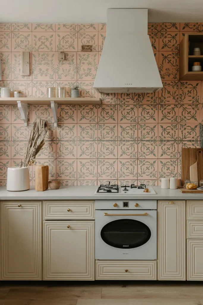
Floral-inspired geometry adds character without feeling overly decorative. Muted coral and olive tones keep the pattern grounded, allowing it to blend seamlessly with neutral cabinetry. This balance ensures the tiles feel integrated rather than applied.
Such patterns suit kitchens that appreciate subtle artistry. The design references tradition while remaining modern through color restraint. Used on backsplashes or floors, these tiles create focal points without overwhelming. The result feels warm, expressive, and thoughtfully composed.
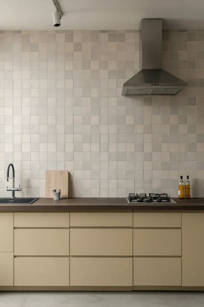
Micro-Pattern Neutral Backsplash Tiles
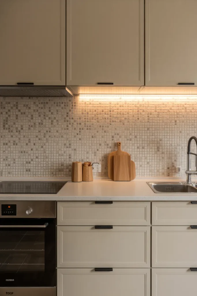
Micro-pattern tiles introduce texture at close range while reading as solid from afar. Warm neutrals ensure compatibility with various cabinet finishes. This approach adds depth without demanding attention, making it ideal for kitchens that favor understated elegance.
Lighting plays a crucial role, revealing pattern gently across the surface. The result feels layered and refined, especially in spaces where simplicity matters. This idea suits homeowners who want interest without bold color or strong contrast, offering longevity and quiet sophistication.
Lavender-Grey Satin Tile Backsplash
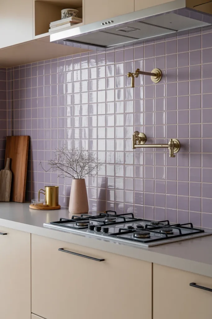
Lavender-grey tiles sit between warm and cool, making them versatile and calming. A satin finish enhances softness, reflecting light subtly. Paired with champagne brass fixtures, the color feels elevated without becoming precious.
This palette works well in modern kitchens seeking a gentle departure from beige or white. The tone adapts to different lighting conditions, shifting throughout the day. The overall effect feels serene, modern, and suitable for long-term living.
Patchwork Tiles in Coordinated Colors
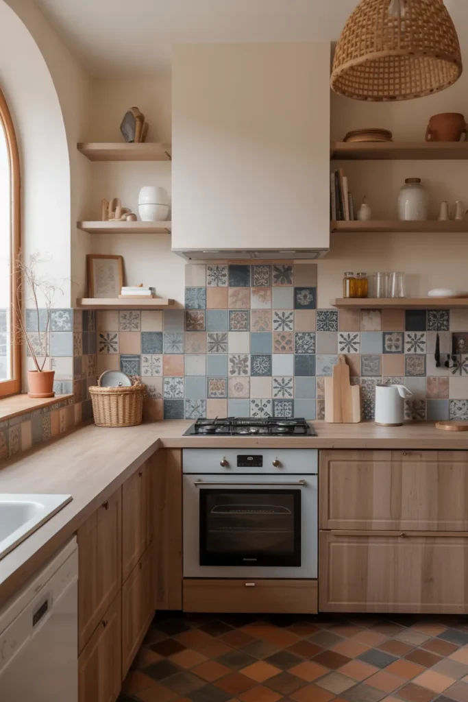
Patchwork tiles feel intentional when colors stay within a cohesive range. Coordinated blues, sands, and terracottas create movement without visual overload. This approach adds personality while maintaining harmony.
Used on floors or backsplashes, the tiles become a storytelling element. The mix suggests history and craft without randomness. This idea suits kitchens that value warmth, individuality, and a sense of place, while still feeling current and usable.
Soft Graphic Rounded Pattern Tiles
Rounded graphic patterns soften kitchen geometry, making spaces feel approachable. Pastel green and peach provide gentle color contrast without sharp edges. This balance keeps the look playful yet mature.
Such tiles work best when cabinetry remains simple. The pattern becomes the focal point, adding interest without clutter. This idea suits contemporary kitchens aiming for creativity without sacrificing calm. The result feels fresh, modern, and subtly expressive.
Diamond Pattern Tiles with Sage Accents
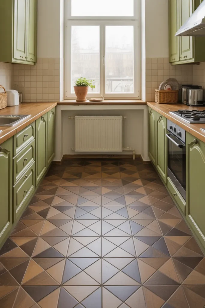
Diamond patterns introduce elegance and structure. Beige tones keep the design neutral, while sage accents add freshness. This combination feels timeless and adaptable to various kitchen styles.
Floor applications benefit most from this pattern, grounding the space visually. The restrained palette ensures longevity. This idea suits kitchens seeking classic geometry with a modern color update, offering both charm and practicality.
Textured Cream Tiles with Subtle Waves
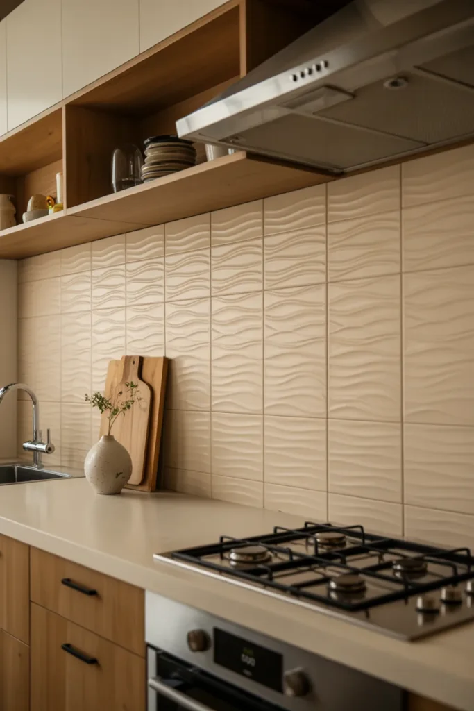
Wave-textured tiles add movement without overt pattern. Cream tones keep the look light and versatile. The texture becomes more visible as light shifts, creating a dynamic but calm surface.
This approach suits kitchens focused on material richness. The tiles feel tactile and crafted, enhancing sensory experience. Paired with wood and soft lighting, the result feels warm, modern, and quietly luxurious.
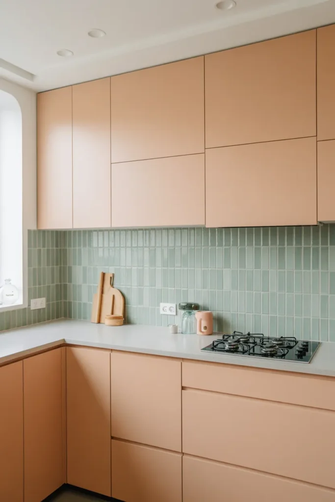
Caramel and Mint Two-Tone Backsplash
Caramel and mint create a balanced contrast between warmth and freshness. Used together in a backsplash, the colors feel playful yet grounded. The combination works especially well with white or cream cabinetry.
This idea suits kitchens that want subtle color experimentation. The tones remain soft, ensuring longevity. The result feels cheerful, approachable, and visually layered without becoming trendy or overwhelming.
Large Square Tiles in Muted Neutrals
Large square tiles simplify visual flow, especially in modern kitchens. Muted neutrals ensure versatility, allowing other elements to shine. Minimal grout enhances continuity, making the space feel larger.
This approach suits kitchens prioritizing calm and order. The tiles act as a quiet backdrop, supporting cabinetry and lighting choices. The result feels modern, timeless, and adaptable to changing décor over time.
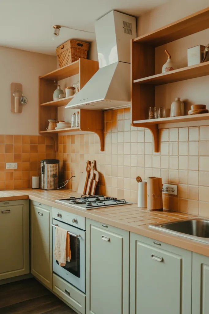
Warm Beige Brick Tiles with Wood Shelves
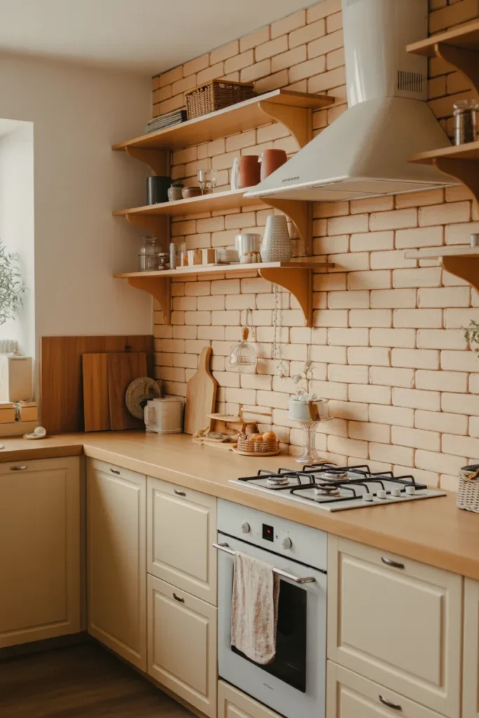
Beige brick tiles offer texture without strong color. Their warmth pairs naturally with wood shelving, creating a comfortable, lived-in feel. The brick format adds subtle rhythm across the wall.
This idea suits kitchens seeking understated charm. The neutral palette ensures flexibility, while texture prevents blandness. The overall effect feels inviting, practical, and well-suited to everyday life in modern homes.